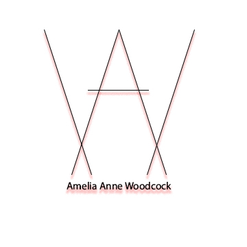
I used my sketches as inspiration for my logo. I really didn’t research very much, because I wanted my logo to be as unique as possible and didn’t want to accidentally copy someone else’s design from the internet. I did google minimalistic logos though so I could get an idea of what that would look like. I wanted my logo to be very simple and minimal because I wanted it to look sleek and clean. I feel like it represents my sleek style and laid-back personality. The design is very balanced. I made the lines of the A and W so that they are the same on the left and right. There is unity within the design, because all of the lines interact in some way. They create an A and a W but they also sort of make two upside down A’s because my initials are AAW and I like to include my middle name. My wish is to be known by my first and middle name professionally, because I will eventually be changing my last name if I get married and want people to still recognize who I am without the old last name.
I used the constructive criticism from my classmates to change my logo. I made the lines slightly thicker and added a red drop shadow for some color. I also changed the font of my name from serif to sans serif to match the font of the initials in the image. I feel like these tweaks made my logo much more interesting.

